B. The red lines are the control lines. The green lines are the warning lines. The blue lines are the one-sigma lines.
C. The daily average failure rate is drawn in black.

| Home Page | Resource Links | Sounding Board | Books |
| Chapter One | Chapter Two | Chapter Three | Chapter Four | References and Photocopying Rights |
from
How to Recognize When Special Causes Exist,
A Guide to Statistical Process Control
© Ends of the Earth Learning Group 1998
by
Linda Turner and Ron Turner
Unit-Count Charts are used to count how often "bad things" or "good things" occur. They are used to identify when changes in the number of "bad things" or "good things" indicate something "special" is occurring. Don't Confuse Proportion Charts with Unit-Count Charts. Proportion Charts assume that results were either "successes" or "failures." Unit-Count Charts assume that an infinite number of "bad things" or "good things" could happen per incident.
|
|
******************
ASSIGNMENT: Figure out how well a system for processing paperwork is functioning.
SIZE OF THE SUBGROUP: One day's work.
MEASUREMENT: The number of errors in a day. This is translated into the number of errors per form for the day.
|
DATA FOR U-CHART EXERCISE
Results from doing an average 85 pieces of paperwork per day
| Subgroup day |
Number of Opportunities "n" = # of paper forms processed |
Count of Errors "c" = # of errors in the subgroup from all forms (some forms had more than one error) |
Unit Error Rate "u" = # errors per opportunity in the subgroup |
| Day 1 | 93 | 25 | .269 |
| Day 2 | 85 | 17 | .200 |
| Day 3 | 85 | 18 | .212 |
| Day 4 | 87 | 23 | .264 |
| Day 5 | 86 | 15 | .174 |
| Day 6 | 85 | 15 | .176 |
| Day 7 | 88 | 16 | .182 |
| Day 8 | 97 | 12 | .124 |
| Day 9 | 80 | 12 | .150 |
| Day 10 | 85 | 13 | .155 |
| Day 11 | 69 | 23 | .333 |
| Day 12 | 84 | 12 | .143 |
| Day 13 | 82 | 11 | .134 |
| Day 14 | 85 | 18 | .212 |
| Day 15 | 76 | 12 | .158 |
| Day 16 | 86 | 18 | .209 |
| Day 17 | 91 | 17 | .187 |
| Day 18 | 89 | 22 | .247 |
| Day 19 | 82 | 22 | .268 |
| Day 20 | 86 | 19 | .221 |
| Total of 20 subgroups | 1700 | 340 | .200 |
| Average | 85 | 17 | .200 |
| Average Variance | 0.002353 | ||
| Average Sigma | .0485 |
NOTE: The raw data is the same as in the P-Chart example from Chapter Two, but the calculated variance and sigma are different.
STEP #1: DO YOU HAVE ENOUGH DATA TO CREATE A CHART?
|
STEP #2: FIND THE CENTRAL TENDENCY
|
In the P-Chart example from Chapter 2, we had a failure rate of 20%. The difference between the U-Chart and the P-Chart is that the P-chart treated a paper form with five errors the same as a form with only one error (both forms were called a failure.) The U-Chart would count the five-error form as being five times as bad as the one-error form.
STEP #3: FIND THE AVERAGE SIZE OF A SUBGROUP
|
STEP #4: FIND THE VARIANCE.
|
STEP #5: FIND SIGMA (THE STANDARD DEVIATION):
|
STEP#6: FIND THE ONE SIGMA LINES
|
STEP #7: FIND THE WARNING LINES:
|
STEP #8: FIND THE CONTROL LINES:
|
STEP #9: CREATE AN SPC CHART
 |
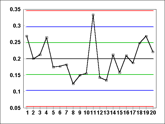
A. The vertical axis measures "Average Errors Per Form". The horizontal axis tracks data by the subgroup day.
B. The red lines are the control lines. The green lines are the warning lines. The blue lines are the one-sigma lines. C. The daily average failure rate is drawn in black. |
STEP #10: APPLY THE EIGHT RULES FOR IDENTIFYING SPECIALNESS
|
STEP #11: ADJUST FOR SUBGROUPS WHOSE SIZES ARE SIGNIFICANTLY DIFFERENT THAN THE AVERAGE SUBGROUP
If you examine the equation for the Variance [ V = u/n ], you will notice that variance is dependent upon "n", the number of opportunities in a given subgroup. Higher "n" values will mean lower variances and standard deviations.
The rule of thumb is this: if you quadruple your "n", the variance will be reduced to one-quarter of its initial value and the standard deviation will be halved. This in turn will make the gap between control lines to come closer by half.
In this data set, the size of "n" varies from 97 on Day 8 to 69 on Day 11. The Variance for these two extremes would be (.20/97 = .002062) and (.20/69 = .002899). Sigma for the two extremes would be .045 on Day 8 and .054 for Day 11.
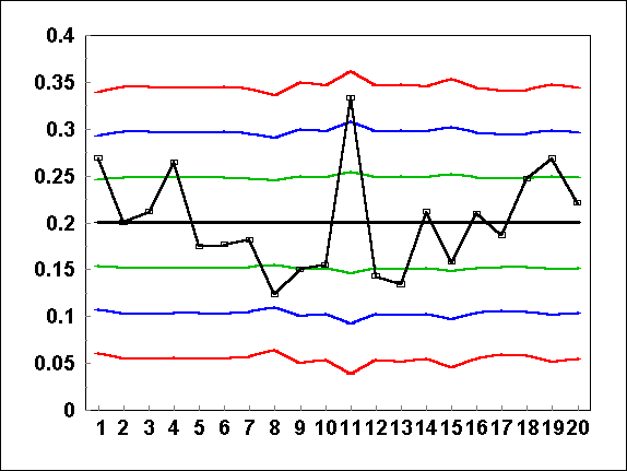
SPC programs do these calculations automatically for you. The resulting control lines step in and out based on how large the "n" is for each day.
 |
The control lines "step" in and out based on the number of opportunities. Day 8 is closer to the Lower Control Line once we take into account "n". |
STEP #12: REMOVE ANY SUBGROUPS THAT HAVE "SPECIAL CAUSES" AND RECALCULATE THE CENTRAL TENDENCY AND SIGMA.
Subgroups that have special causes are by definition not part of a stable process. Remove them from your data base and recalculate the central tendency and control lines. Usually this causes the control lines to come closer together. It is conceivable that after recalculating them, more subgroups will fall into a "special" category in which case you would repeat step #12.
For our sample data in this chapter, we had no indication of special causes and therefore don't have to recalculate anything. Most commercial programs for calculating SPC don't do Step #12 automatically meaning you will have to manually delete the data from your data base for the subgroups that appear special.
C-CHARTS A different form of a U-Chart is the C-Chart (or Count-Chart.) You can use C-Charts only if the subgroups are the same size everytime. In this way, a C-Chart is to a U-Chart the same as an np-Chart is to a P-Chart. As an example here, assume that you began with the same raw data as above for the U-Chart, but the opportunities ("n") (at 85) were the same every day.
The central tendency is the average "c" per subgroup. In this case, the central tendency was 17 rather than .200 that we used in the U-Chart. This means that on average, we had 17 errors per 85 forms (which we found by dividing 340 errors by 20 subgroups). Computationally, average "u" is found by dividing the average "c" (in this case 17) by the size of the subgroup (in this case 85). This means that "c" is "nu" or 85 times bigger than the average "u" of .200 or (85 times the "u" of .2 = the "c" of 17.)
The variance for the C-Chart is simply the same value as the average "c" per subgroup. In this case, it would be 17. Why is variance the same value as the mean? Computationally, the variance for the U-Chart was average u/n (or .20/85). Because variance is a summing of the square of the differences between an expected average and a particular value, the variance for average "c" should be n-squared times the size of the variance for "u". In other words the variance for average "u" which is (u/n) will become (u/n)(n ²) = nu or 17 for this sample. If you don't understand this part, don't worry and simply use the rules.
Sigma is the square root of the variance. For this example, the square root of 17 would be 4.1. The One-Sigma Lines would be at 21 and 13. The Warning Lines would be at 25 and 9. And the Control Lines would be at 29 and 5.
In comparison, the U-Chart Control Lines were .3455 and .055. If these values are multiplied by the subgroup size of 85, you would get Control Lines of 29 and 5, the same as we calculated above.
For tips on how make your SPC charts more sensitive, see Appendix A of Chapter Two.

| Top of page | Home Page | Resource Links | Sounding Board | Books |
| Chapter One | Chapter Two | Chapter Three | Chapter Four | References and Photocopying Rights |